Visualizing Data
When we revisit, I suggest renaming sort data to sort counted data (for example) as that's the only input it seems to accept. Also, we should update our block names to newer format (so the resulting expressions are sentence readable) and without all the colons. --MF, 12/10/21
I changed every "we" on this page to "you." This is probably an issue on all the other pages, too, but this is where it really hit me hard, in "We don't need to type..." after 1.3.2.2. --bh
Consider splitting into two pages. --MF 7/22/24
In this activity, you'll input your cleaned research data in Snap! and create a visualization of the results.
So far, you've defined your research question, collected data, and cleaned up the data. Before you can analyze your data, you'll need to import the data into Snap!.

Maybe change the background color of
the first three boxes of that flowchart to indicate
where we're up to? -bh 2/6/22
Digitizing Your Data
- Open this Visualizing Data project, and save it to your account. (You'll need to log in if you aren't logged in already.)
The split lines block

Your inputs to split lines will be different based on the data your collect.
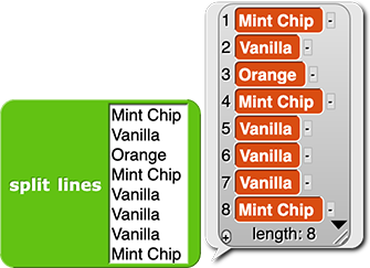
turns multiple lines of text into a list. You could just type directly into a list block, but this makes typing lots of data easier. For example, here's how you could type in a bunch of ice cream flavor choices:
- Type your cleaned responses to
your research question into the block, making
sure to hit the ENTER key after each response
but the last.
You don't need to type names of the classmates in the list, since their name doesn't matter for this analysis, just their response. (Why did you collect the names in the first place? You wanted to make sure that each classmate only responded once.)
Nowhere on the previous page does it say to collect students' names along with their answers. -bh 2/6/22; followup from PG Yes, and why not make this a discussion question rather than an instruction followed by a question that you then answer? Like: Why don't you need to type the names of the classmates, too? And why would you collect those names if you're not using them here? --pg
- Once you've typed all the responses, click the block. You should see the list of responses, numbered in the order entered, plus the total length of the responses as in the picture above.
 Does the length match the number of students you surveyed? Does everything else look okay?
Analyzing Your Data
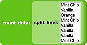
The  block counts the number of times each category shows up in the survey results. There input slot is not a blank you can type into, but contains an striped icon
put image here
that indicates that it takes a list as input. I've removed "the first block you'll use" and "the next block" etc. Briefer, less directive, and obvious anyway.
-
Your inputs and results will be different.
Drag the list you just created into the list input slot to get something like this:

-
Now click on the block to see
the analysis! You should see a list of category counts showing each category and a quantity next to each category.

Visualizing Your Results
There are multiple ways you could visualize this data, like a bar chart, column chart, or row chart.
This just invites the teacher to give a lesson on vocabulary. I'd just write "There are many ways to display data. Today you'll make..." An advantage of the pictograph is the learning how to use the pictures, but a disadvantage is that it is back to the very first elementary school forms they've seen. Yes, they're now learning to do it with a computer, but.... --PG
Today you'll make a pictograph, a very eye-catching way to present this sort of data.
"bar chart, column chart, or row chart." Are "column chart" and "row chart" technical terms that mean something other than their obvious meanings? Because a bar chart can have vertical or horizontal bars, and so can a pictogram. So I don't see the quoted three choices as mutually exclusive. I would be inclined just to leave that out: "There are various ways you could visualize this data. Today you'll make..." especially because I also don't like that "like" where it should say "such as." --bh 2/6/22; As I say, just vocabulary and, right, these are not technical terms!! School is already too full of school-only vocabulary. --PG
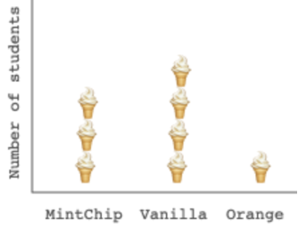
A pictograph is a type of chart that displays quantities for different categories. Here's an example that shows the favorite ice cream flavors from the example data above:

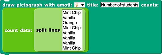
The draw pictograph block is responsible for that output:

The script should look something like this:

- Click on the block to see your pictograph. It should show up on the stage instead of in a bubble, since this is a command block. A command block changes something about the environment, like drawing on the stage, but doesn't directly report a value.
 How does it look? Is your data as clean as you hoped? You can still clean up data now, if the graph has made some messy data more obvious than before.
-
If you want to customize your graph, you can use the
sort data block to order the data so that the categories are ordered by largest to smallest values, smallest to largest values, or alphabetically.

Just drag the count data block out of its slot, drag it into sort data, then drag them both into the original slot in draw pictograph. Choose whatever ordering works best for your graph. The whole command block would look something like:


- Now show off your work and check out your classmate's pictographs!
In this activity, you imported your data into Snap!, set up a table to count it, and created a pictograph to visualize the results.


 block counts the number of times each category shows up in the survey results. There input slot is not a blank you can type into, but contains an striped icon